FMP UAL ART + DESIGN
ASHTON PACION

Ian Zhang is an artist I am researching who is well known for his animations. I discovered his work on TikTok. This video produced by Zhang is an animation to the song “Get up - NewJeans” The video contains imagery of the members of the K-pop group NewJeans. The video has a slow and dreamy animation with captivating imagery of the cast members. Zhang exclusively uses blue as the main colour throughout the video which sets the tone of a calm vibe and complements the slow, angelic sound of the song as it is animated. Something I like about this animation is how Zhang captures movement with only using limited frames, Despite the animation not being very fluid, he still manages to capture the liveliness of the movement making it look expressive and bubbly. I'd like to try this technique in my FMP, especially for parts where detailed movement isn't crucial. It seems like it could help me save time during the animation process.
TITLE: "NewJeans - Get Up (Animation)"
DATE: SEP 29, 2023
MEDIUM: ANIMATION
LINK: https://youtu.be/2He2wVAFXqY
This animation by Ian Zhang to the song “Cupid - FIFTY FIFTY” was an animation I came across on Youtube. The video seems to revolve around the challenges of finding love, portraying the character's struggles with romance through various scenes. With a colour palette dominated by shades of pink, the animation effectively complements the themes of love as well as passion. What stands out to me about this animation is the storytelling through vivid imagery. Zhang skillfully conveys a clear narrative through exaggerated body language and visuals, this is something I aim to incorporate in my own FMP when it comes to effectively conveying my story.
TITLE: "FIFTY FIFTY - Cupid (ANIMATION) (Twin Version)"
DATE: APR 8, 2023
MEDIUM: ANIMATION
LINK: https://youtu.be/KFNb0dZjXCI
This short animation is a video I came across on Zhang’s YouTube channel titled “A date...? (CHAINSAW MAN ANIMATION) (chap 112)” The concept behind this video seems to be an animated adaptation of a scene from the manga "Chainsaw Man," which Zhang has brought to life through animation. The art style appears to be intentionally similar to the original manga, as Zhang aimed to replicate the manga's distinctive artistic style in the animation. Something that captivates me about this animation is the inconsistent clean lines in each frame. While the animation lacks perfect smoothness and consistency, it still avoids being choppy enough to appear odd. I feel this irregularity gives the animation a certain flair and adds charm to it, almost like a deliberate creative choice that complements the comic-like nature of the animation. This feature may be something I want to incorporate into my animation style to infuse my work with a touch of uniqueness.
TITLE: "A date...? (CHAINSAW MAN ANIMATION) (chap 112)"
DATE: NOV 25, 2022
MEDIUM: ANIMATION
LINK: https://youtu.be/yrPicT_u9m4
CREATIVE RESPONSE
ROUGH ANIMATION

CLEANUP
COLOURING/ COMPOSING

FINAL RESULT!
ANIMATION PROCESS
IBIS PAINT X

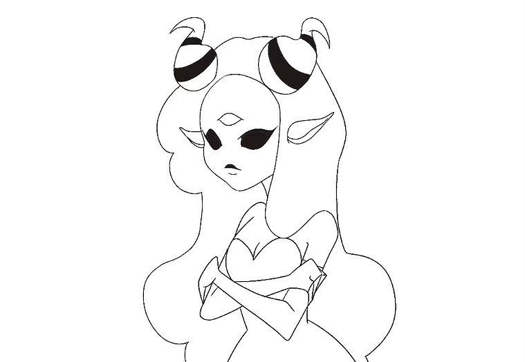
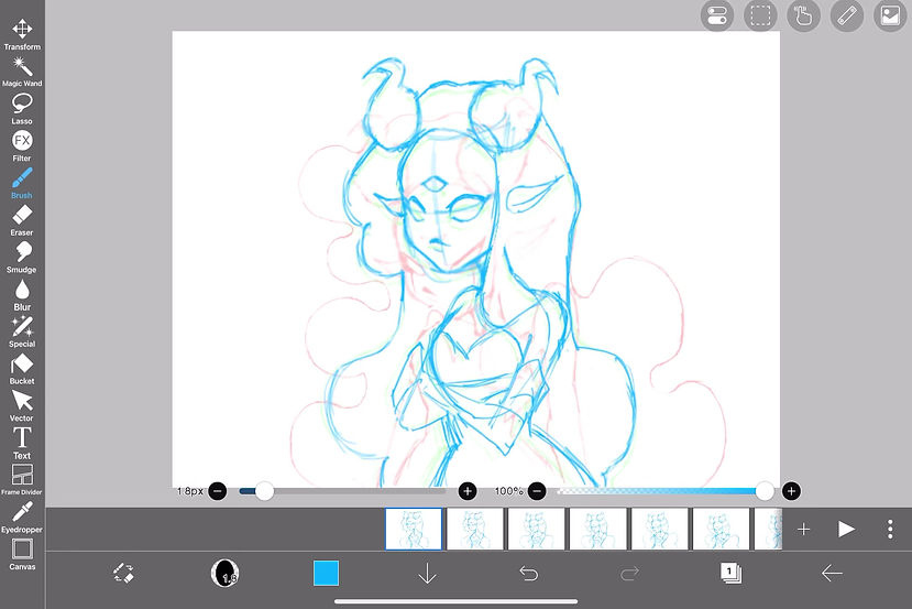
When making the initial animation for my reply to Ian Zhang, I used the "ibis Paint x" app to sketch the frames. This animation needed more frames due to increased movement, which allowed me to animate from one pose to another. I used a frame rate of 20 frames per second for this animation. This project encouraged me to experiment with different frame rates. In the future, I aim to delve deeper into understanding how FPS works, as it's a concept that I haven't fully grasped yet.


When I brought the rough animation from ibis paint to procreate dreams, I started the cleanup stage by adding a layer above the video to draw the lineart. I adjusted and refined any areas in the animation that didn't look right, which involved adding extra frames and adjusting the length of frames to achieve the desired effect. My proficiency and familiarity with this app have certainly improved after my third time using it.
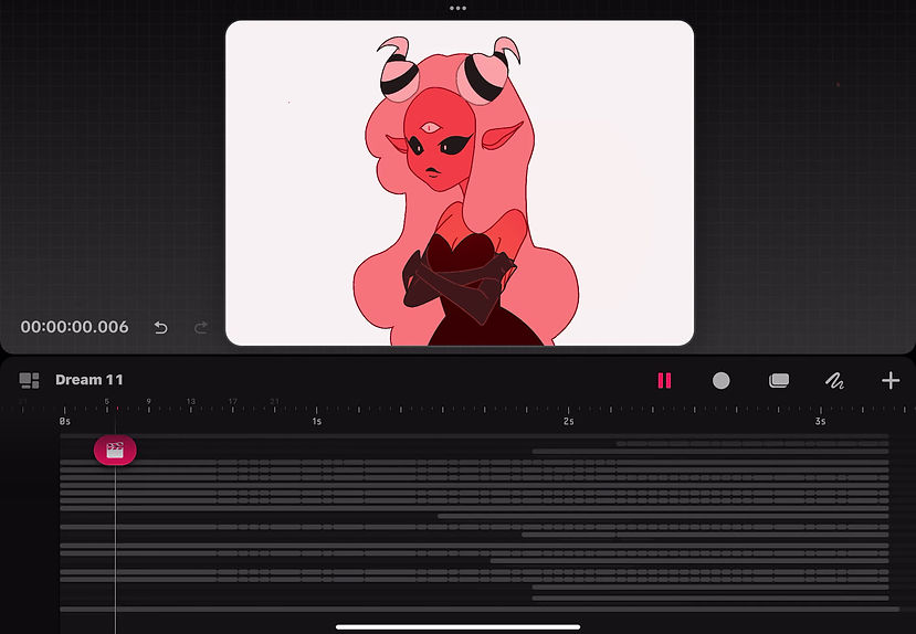
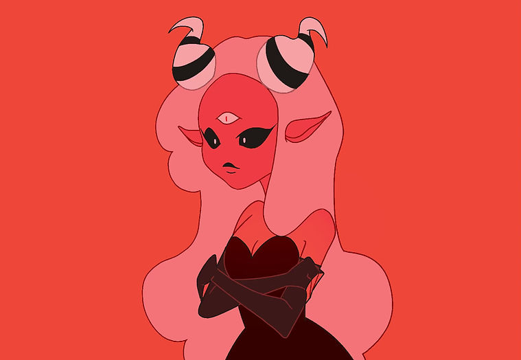
The coloring and composing stage proceeded smoothly as I didn't dwell too much on rendering intricate details. It primarily involved using clipping masks and blending modes to produce a simple colored animation that complemented Ian Zhang's style of work.
CREATIVE RESPONSE EVALUATION
I'm satisfied with how my animation in response to Ian Zhang turned out. From Zhang's work, I noticed his distinctive animation style, particularly the deliberate choppiness in the frames, which gives off a unique sense of movement that's not overly fluid but still brings the animation to life. I aimed to capture this characteristic in my creative response. Additionally, I drew inspiration from Zhang's use of color palettes, where a single main color scheme complements the animation's mood. For my response, I chose shades of red to convey the emotion of anger, aligning with the gradual transition of my original character from calm to furious. I believe that utilizing colour to convey emotion in my final major project will significantly enhance storytelling and visual impact.
While fluid animation isn't my primary focus for my final project, I aspire to replicate this distinctive animation style. However, I acknowledge the need for improvement in the colour tones. Upon completing the animation, I realised that the shades of red were too similar, causing the background to blend too much with the character's skin tone, making it difficult to differentiate between the two. Although I attempted to address this issue with an overlay, it didn't yield the desired effect. Next time, I will ensure to use distinct, stronger values to avoid this blending.